Posts mit dem Label dekor werden angezeigt. Alle Posts anzeigen
Posts mit dem Label dekor werden angezeigt. Alle Posts anzeigen
18.05.2017


14.02.2017
A Decorative Cosmology Bridging Heaven and Earth
In her new exhibition, Tamara Gonzales continues to mine our material culture to chart the world all around.
 A view of Tamara Gonzeles’s Ometeotl exhibition (all images by the author for Hyperallergic)
At the heart of Tamara Gonzales‘s new body of work at Klaus von Nichtssagend Gallery is a room of tapestries woven by artisans in the Peruvian towns of Písac and Ayacucho. They are vibrant interpretations of the artist’s drawings and they add yet another layer to the decorative language she continues to mine from the material world around her.
Gonzales is known for incorporating visual culture that has traditionally been more associated with lived culture — lace, graffiti, embroidery, textiles — rather than the world of art galleries. A large functional maraca is propped up by the entrance, which signals the inclusive and non-hierarchal attitude towards influence she celebrates in her work. A large maraca sculpture near the entrance of the exhibition, “Maraca más grande con plumas” (2016)
Past the over-sized maraca, there is a corridor of small drawings dominated by a curvilinear window motif that offers her a compositional frame to puncture, cover, and react to. But even with this structure, the drawings have an experimental energy that pokes and pushes, often jostling forms that resemble easter eggs, stick figures, plants, or the scribblings of a rudimentary language.
Her true subject matter is the material world. She has an indiscriminate appetite for cross-cultural pollination and distills the dissonance of contemporary life into these objects that can seem as jarring as they are soothing.
The title of the exhibition, Ometeotl, refers to a nebulous concept of spirituality that some scholars of Mesoamerican culture dispute, but it is commonly believed to refer to the “creator of all creation” for the Anawak people and a compound of “dual” and “cosmic energy” in the native language of Nahuatl. That ambiguity of the term perfectly reflects the primordial soup that has spawned these works, at once mythic, while relishing their connection to earthly forms.
Looking at her paintings, you can feel unmoored from the boundaries of form as they swim in waves of moody azure, crimson, and the muddy waters of darker hues. The paintings vibrate and ripple in your mind’s eye as they play with proportion — always challenging the relationship of ground and subject — to settle visually like a shaken snow globe. Many of the large paintings, like “Two Moons” (2016), feel contradictory, contrasting the washes of violet paint against the frenzy of patterns that form the sky and ground for a setting Mesoamerican roundel.
The showstoppers, though, are the tapestries. Gonzales’s starry fields and human-like forms are translated into undulating visions of horror vacui. They are her best works yet, offering us a unique synthesis of the world around her but allowing it to develop into these intensely colored objects (she says the women doing the embroidery were given free reign to translate her drawings, based on patterns they normally embroider). The works, which are all untitled and made of alpaca and wool, convey a sense of cosmic cartography. If anything, the embroideries make the paintings seem more conventional, showing how her many bodies of work may overlap but travel in different directions.
The paintings are declarations of the known, the drawings are suggestions of what can be known, while the woven works are proposals for what we may never ever truly know. Tamara Gonzales, “Two Moons” (2016)
 Tamara Gonzales, “I Am the Hummingbird” (2016)
 The room of embroidered works
 Tamara Gonzales’s untitled drawing (2015) and the related untitled tapestry (2016)
Untitled tapestry (2016)
A view of Tamara Gonzeles’s Ometeotl exhibition (all images by the author for Hyperallergic)At the heart of Tamara Gonzales‘s new body of work at Klaus von Nichtssagend Gallery is a room of tapestries woven by artisans in the Peruvian towns of Písac and Ayacucho. They are vibrant interpretations of the artist’s drawings and they add yet another layer to the decorative language she continues to mine from the material world around her.
Gonzales is known for incorporating visual culture that has traditionally been more associated with lived culture — lace, graffiti, embroidery, textiles — rather than the world of art galleries. A large functional maraca is propped up by the entrance, which signals the inclusive and non-hierarchal attitude towards influence she celebrates in her work.
A large maraca sculpture near the entrance of the exhibition, “Maraca más grande con plumas” (2016)Past the over-sized maraca, there is a corridor of small drawings dominated by a curvilinear window motif that offers her a compositional frame to puncture, cover, and react to. But even with this structure, the drawings have an experimental energy that pokes and pushes, often jostling forms that resemble easter eggs, stick figures, plants, or the scribblings of a rudimentary language.
Her true subject matter is the material world. She has an indiscriminate appetite for cross-cultural pollination and distills the dissonance of contemporary life into these objects that can seem as jarring as they are soothing.
The title of the exhibition, Ometeotl, refers to a nebulous concept of spirituality that some scholars of Mesoamerican culture dispute, but it is commonly believed to refer to the “creator of all creation” for the Anawak people and a compound of “dual” and “cosmic energy” in the native language of Nahuatl. That ambiguity of the term perfectly reflects the primordial soup that has spawned these works, at once mythic, while relishing their connection to earthly forms.
Looking at her paintings, you can feel unmoored from the boundaries of form as they swim in waves of moody azure, crimson, and the muddy waters of darker hues. The paintings vibrate and ripple in your mind’s eye as they play with proportion — always challenging the relationship of ground and subject — to settle visually like a shaken snow globe. Many of the large paintings, like “Two Moons” (2016), feel contradictory, contrasting the washes of violet paint against the frenzy of patterns that form the sky and ground for a setting Mesoamerican roundel.
The showstoppers, though, are the tapestries. Gonzales’s starry fields and human-like forms are translated into undulating visions of horror vacui. They are her best works yet, offering us a unique synthesis of the world around her but allowing it to develop into these intensely colored objects (she says the women doing the embroidery were given free reign to translate her drawings, based on patterns they normally embroider). The works, which are all untitled and made of alpaca and wool, convey a sense of cosmic cartography. If anything, the embroideries make the paintings seem more conventional, showing how her many bodies of work may overlap but travel in different directions.
The paintings are declarations of the known, the drawings are suggestions of what can be known, while the woven works are proposals for what we may never ever truly know.
Tamara Gonzales, “Two Moons” (2016)Tamara Gonzales, “I Am the Hummingbird” (2016)The room of embroidered worksTamara Gonzales’s untitled drawing (2015) and the related untitled tapestry (2016)Untitled tapestry (2016)


02.04.2016


31.03.2016
Lost and Invisible Bodies, Enshrined in Glitter and Bling
by Jillian Steinhauer on March 30, 2016

Installation
view, ‘Ebony G. Patterson: Dead Treez’ at the Museum of Arts and
Design; in foreground: “root and shrubz” (2014), mixed-media jacquard
photo tapestry with embroidery, glitter, toy gun, shoe, lace, glasses,
toys, silk flowers, embellishments (all photos by the author for
Hyperallergic) (click to enlarge)
“In order to force one’s way out of invisibility one has to create a reason to be seen,” says Jamaican artist Ebony G. Patterson.
I walk around the tapestry, which rests on the floor, in an attempt to see its contents more clearly. There are two toy guns covered in floral prints; flowers everywhere, embedded in glitter and sitting atop the surface in silk; a miniature lace skirt; two toy trucks. There is another body, much smaller than the first, represented by a camouflage outfit. This one, like the first, is a body only by virtue of its clothing: shirt, pants, shoes. There is no head to speak of, no arms or flesh.
“There is a challenge being made about seeing and looking. The seeing is what happens on social media, but the looking is what I’m asking you to do,” says Patterson.
What is the relationship between these two sets of clothing without bodies? Am I looking at a mother and her son — or the remains of them? Where were they going? Were the guns only toys? How did the mother’s right shoe — a dazzling boot, a glittering, embroidered articulation of turquoise and white set atop a thick black heel — end up so far from her leg? Whose shoe is the other one — a three-dimensional red and black slipper — that sits near it?
Where are the bodies?

Detail
of Ebony G. Patterson, “wilted rosez” (2014), mixed-media jacquard
tapestry, with embroidery, glitter, caftan, costume jewelry, glass,
eighty black crocheted flowers, embellishments
what you’ll turn up. Quite often, bones,” writes Jamaican poet Olive Senior.
In the other tapestries, it’s the same story. I go looking for bodies but all I find are clothes. Brilliant, beautiful ones, but the bodies they’re meant to hold have vanished. Decomposed, maybe. Broken back down into the thickets of flowers and jewels, objects and ornament that envelop them. I train my eyes to trace the outlines of the blinged-out outfits. I recondition them so that they can see. I don’t see the bodies, but I know they are here.
* * *
On the other side of the space, there are
10 bodies, all made of plastic and covered in floral and arabesque
patterns — dots and stripes, plants and curlicues enveloping both their
outfits and every inch of their fake skin.

Ebony G. Patterson, “Swag Swag Krew” (from the ‘Out and Bad’ series) (2011–14), ten embellished mannequins with custom-made clothing, including an adorned umbrella, alcohol, shoes, costume jewelry, toys, cell phones, silk flowers, cinder blocks, hats, backpacks, accessories, cotton textile–covered plinth (click to enlarge)
25.03.2016
The Yellow Wallpaper

https://www.nlm.nih.gov/literatureofprescription/exhibitionAssets/digitalDocs/The-Yellow-Wall-Paper.pdf
Mental Illness in Literature: Charlotte Perkins
Gilman's "The Yellow Wallpaper Updated on August 8, 2014
Mental Illness in American Literature
Gilman's most famous work, her short story "The Yellow Wallpaper", published in 1892, is about a woman suffering from mental illness after of being confined to a bedroom in the attic of a vacation home by her husband, John, for the sake of her health. She becomes obsessed with the room's repulsive, yet alluring yellow wallpaper. Gilman wrote this story to bring light to women's role in society, explaining that women's lack of autonomy negatively affects their mental, emotional, and physical well-being. She used it as a call to action for readers to recognize the legitimacy and complexity of illness and benefit in therapies for treatment, namely in women, and to overcome sexism in treatment
The narrator explains the embodiment of the authors experience during
her time being treated by Dr. Mitchell's "rest cure". The treatment,
which includes no physical activity, mental stimulation, or hobbies, is
in direct conflict with what the author needs to get well. This drives
her further into madness until she descends beyond the point of getting
better.
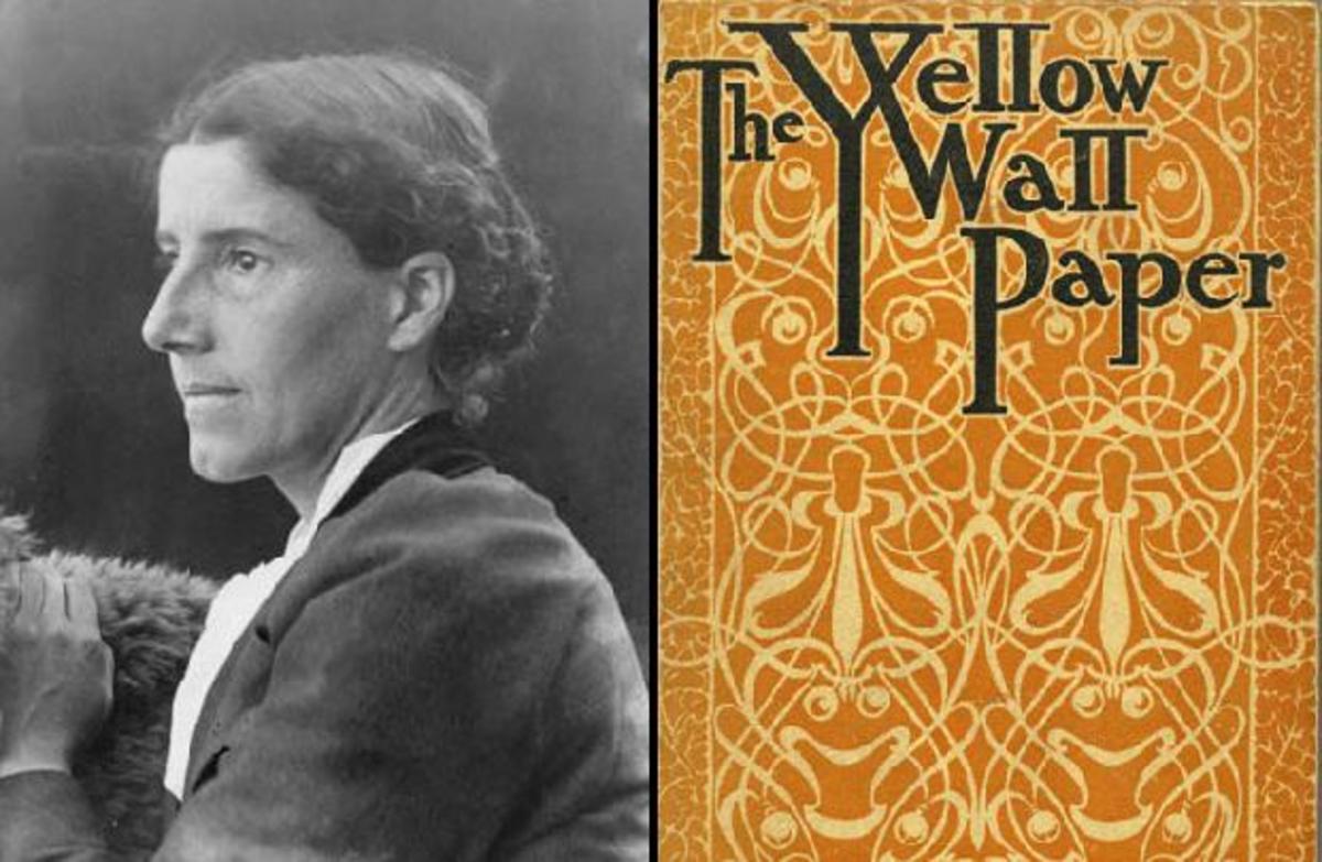
Left: Charlotte Perkins Gilman Right: "The Yellow Wallpaper" cover
17.02.2015


04.05.2014
Ornamentbegriffe
Der Ornamentbegriff in der Renaissance
In Anlehnung an Vitruv schreibt der Architekt und Theoretiker Leone Battista Alberti in seiner „De re aedificatoria“ („Über die Baukunst“, 1452): „In tota re aedificatoria primarium certe ornamentum in columnis est.“ Säulen sind also für Alberti in einem Ornamentbegriff als Schmuck des Baus eingeschlossen. (Buch 6, Seite 2). Weiter definiert er auch figürliche Wandmalerei als Teil dieses „Bauschmucks“.
Der Ornamentbegriff im Barock
Der Kunsttheoretiker und Künstlerbiograf Filippo Baldinucci schrieb in seinem 1681 in Florenz erschienenen „Vocabolario Toscano dell’arte del Disegno“ („Toskanisches Inventar von der Kunst des Entwurfs“): „Abellimento, e dicesi propriamente dicose materiali, che si aggiungiono intorno che che sia, per farlo vage e belle.“ („Verzierung nenne ich es, wenn Materialien zum Gegebenen hinzukommen, um es schön und eigenartig zu machen.“)
In Frankreich ist der Begriff ornemens gleich dem lateinischen ornamentum zu setzen und taucht in der Kunstliteratur seit dem 16. Jahrhundert auf.
Im deutschen Sprachraum sind die Begriffe Zierrat, Zierung, Beizier bis ins 19. Jahrhundert vorherrschend, so z.B. schon in der ersten deutschen Ausgabe Vitruvs, übersetzt von Walter Rivius (auch Walter Ryff, „Vitruvius Teutsch“, Nürnberg, 1548), in der es in Buch 4, Kapitel 2, heißt: „Columnen, sampt deren etlichen angehorigen theil glidern und ornamenten oder zierungen.“
Im wichtigsten deutschen enzyklopädischen Lexikon des Barock, im „Grossen vollständigen Universal-Lexicon Aller Wissenschafften und Künste“ von Johann Heinrich Zedler (1732 ), findet sich der Verweis „Ornamentum siehe Zierrath“ und die Definition: „Schmuck, Putz, Ornat, Zierrath, Ornatus oder Ornamentum, heißt überhaupt alles dasjenige, was zwar auf dem Leibe, nicht aber so wohl zu nötiger Bedeckung desselben als vielmehr nur zum Staate und Pracht getragen wird.“ (Band 35, Spalte 471)In der kritischen europäischen Ornamentdebatte des 18. Jahrhunderts, wesentlich von den Akademien ausgetragen, wurde den Ornamenten schließlich ein Eigenwert zugestanden, der sie aus der Rolle einer eher untergeordneten Kunstgattung befreite.
Abgrenzung Muster / Dekoration
Das Muster ist eine einfache Linienkomposition, die von Ornamenten abgeleitet sein kann, wie zum Beispiel der griechische Mäander.
Als Dekoration hingegen bezeichnet man eine objektgebundene Flächenkomposition aus einzelnen Ornamenten. Ornament und Dekoration stehen einander spannungsreich gegenüber. Das Ornament ist ungebunden und frei versetzbar, die Dekoration an die durch das Objekt vorgegebene Fläche streng gebunden. Während das Ornament als stilisiertes Einzelmotiv in beliebiger Wiederholung auftreten kann, bildet die Dekoration eine ausgewogene Gesamtkomposition. Die Dekoration unterliegt zeitgebundenen Variationen und Veränderungen, das Ornament einer strengen Tradition. Daraus ergibt sich, dass mit nahezu gleich bleibenden Ornamenten höchst verschiedenartige, stilistisch wandelbare Dekorationen gestaltet werden können.
Ornament und Rhetorik
Bei Vitruv und Alberti leuchtet die schon in der griechischen Antike gegebene Herkunft des Ornamentbegriffs aus der Rhetorik durch. Es besteht eine Verbindung zum rhetorischen ornatus unter dem Eindruck des Horaz’schen „Ut pictura poesis erit“ („Dichtung ist wie Malerei“), das heißt der Begriff wird über Redekunst und Dichtung hinaus auf die Architektur und die bildenden Künste im allgemeinen angewendet, in der frühen Neuzeit vor allem aus dem Geist des Humanismus heraus. So lässt sich die Integration der Baudetails in die Ornamentik in der Neuzeit erklären, besonders bei Alberti, der ja selbst aus der Dichtung seinen Weg zur Kunsttheorie fand.
Der römische Rhetor Quintilian legte in der 1415 von Poggio Bracciolini in der Bibliothek des Klosters Sankt Gallen für die Neuzeit wieder entdeckten „Institutio oratoria“ (92–96 n. Chr.) fest: „Das Geschmückte ist alles, was mehr ist als nur klar und genau.“ Schmuck wird so als das Wesentliche eines Kunstwerks herausgehoben, acutum (Witz), nitidum (Glanz), copiosum (Fülle), hilare (Lebhaftigkeit), iucundum (Charme), accuratum (Sorgfalt) werden als die Komponenten der gratia bei Quintilian genannt, die in seiner Sicht eine Rede zum Kunstwerk macht.
Derartige Begrifflichkeiten werden bis ins 18. Jahrhundert außerrhetorische Kunsturteile mitbestimmen. Die Ornamentik wird auf diese Weise auch zu einer Art Sprache, dem gebildeten Betrachter in ihrer Rhetorik verständlich.


Tales of the Arabesque
 *
*
 *
*
 *
*
 *
*
 *
*
 *
*
Abonnieren
Posts (Atom)